Yoco
Introducing YOCO—Your personal financial coach: a financial app with the goal of coaching and helping you be better with your finances and investments.
About the Project
This is a group project by Valeria Garci-Crespo Lopez and Dustin Kummer created during the course Crafting User Interfaces with Christian Hertlein (Head of Design at N26) at the University of Applied Sciences Potsdam
We were dealing with the aspect of money in a digital world—Especially with the key topics Trust and Financial Literacy.
Our task wasn’t to only design a solution that had to deal with money but also think about a product that builds trust with the user and support the user in becoming more financially literate.
Ideation
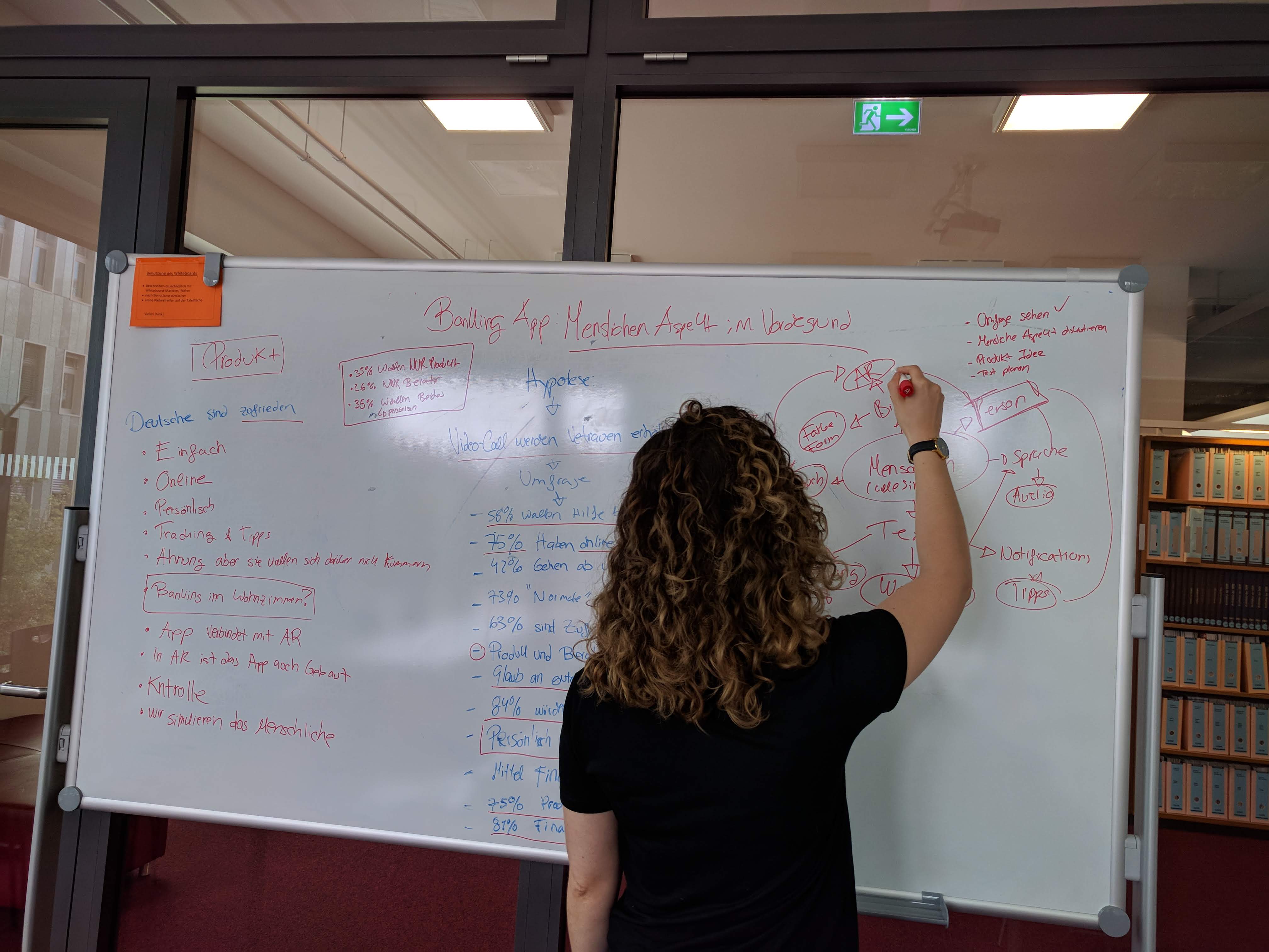
Our extensive desk research consisted of reading several research papers and articles to understand what trust means, how banks build trust and how to potentially activate financial literacy.
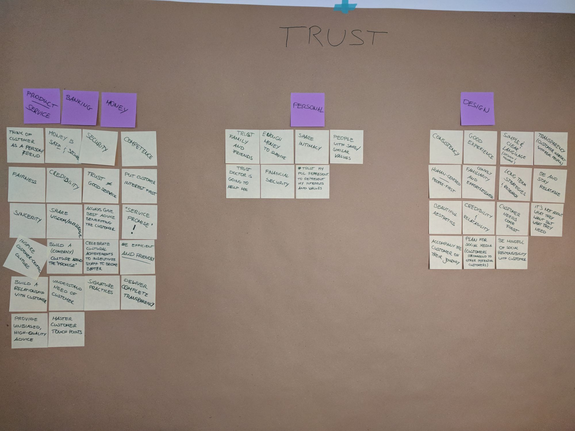
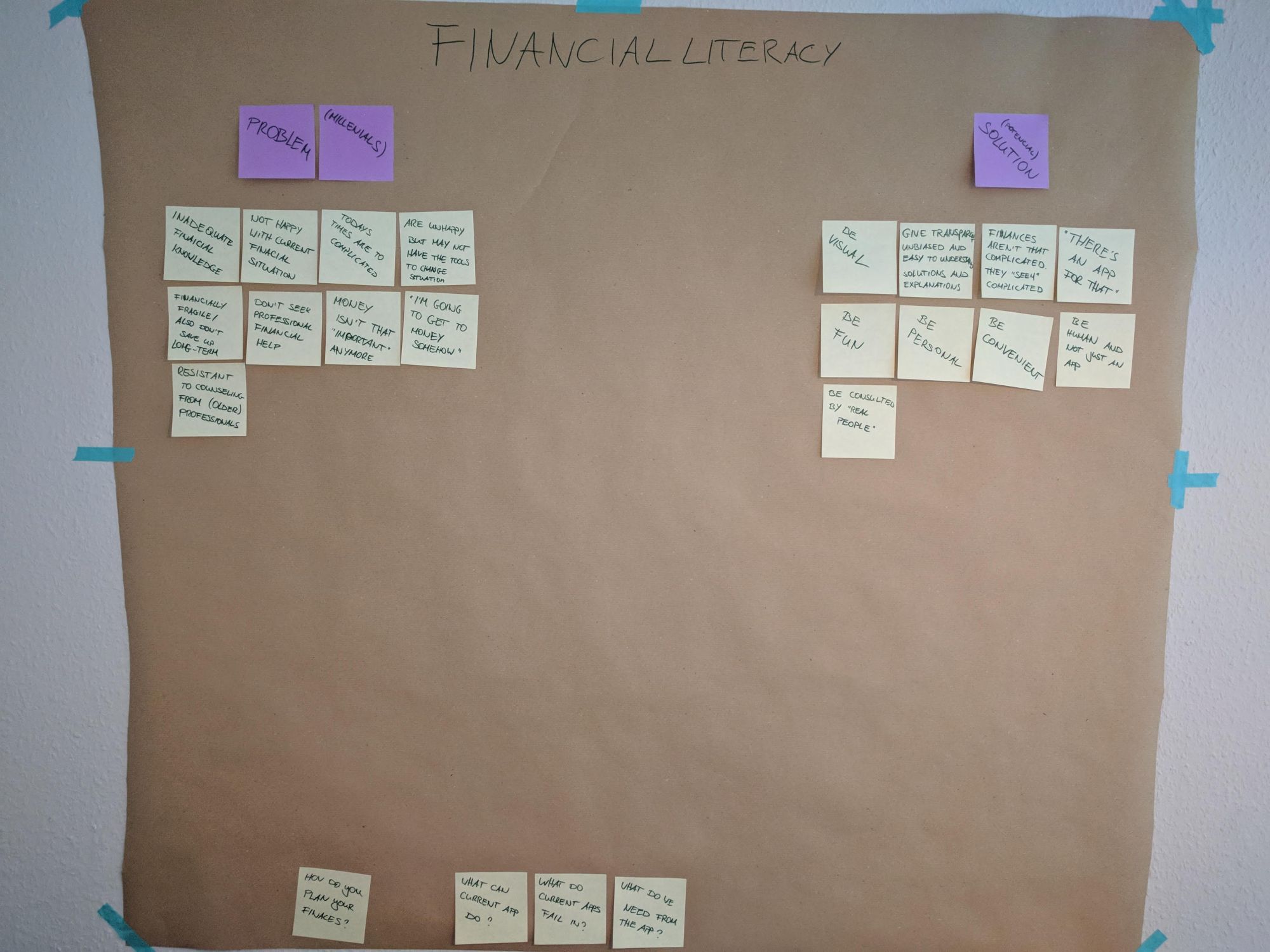
Ideating on these topics we were able to come up with several ideas for our final product in which we finally decided on the following:
A Banking App with focus on the Human Aspect –
We decided to concentrate our efforts on bringing back the human aspect in our App.
It was important for us to design a solution that feels more human and more personal, since online banking evolved itself to be a rather impersonal experience where no real human interaction exists anymore.
- What will happen in the near future once traditional bank branches are no more?
- If we want people to be more financially literate wouldn’t it be great you had a coach for yourself?
- We are social beings, why not create an online-based platform that would help you with your finances?
- Most importantly, can we build trust with human interaction through an App when dealing with a serious topic like money?
Target Group
We decided to set our target group to young millennials (people between 20 and 30). This decision was based on a specific theme several papers had: Millenials lacking sufficient financial (literacy) skills and having little concern in planning out their own future. We found this quite fitting to build upon.
Persona and Scenario
Because of time constraints we had to create our scenario with just one persona. The scenario will help us understand how to design our product.
Persona

Roberto, 28
Studies design on his last year of his master’s degree and works as a freelancer as well.
Motivations (why does this Persona need our product / service?)
- He wants to be personally advised on his finances.
- He does not want to be too dependent on a service
- He realizes that, because of his lifestyle, he spends far too much money
- He wants to have a better overview of his finances and how he can improve it
- He wants to save further for his future
Personality
- Existential Fears
- Positive
- Hard-working
- Outgoing
Frustrations
- Does not trust traditional banks, due to the financial crisis in Spain
- He’s afraid of not making the right decisions
- He does not understand the bank system very well and finds it way too complicated
- He is always stressed out when writing bills and the tax declaration
Ideal experiences / goals / aspirations / feelings
- He wants to have a product/service that gives him security about his finances
- He finally wants to trust a financial institution again
- He wants to have a personal advisor who understands his wishes and needs
- He wants to plan his expenses better
- He wants to choose his advisor but does not want to go to a branch
- He wants to have control over his finances and the product that he is using.
Scenario
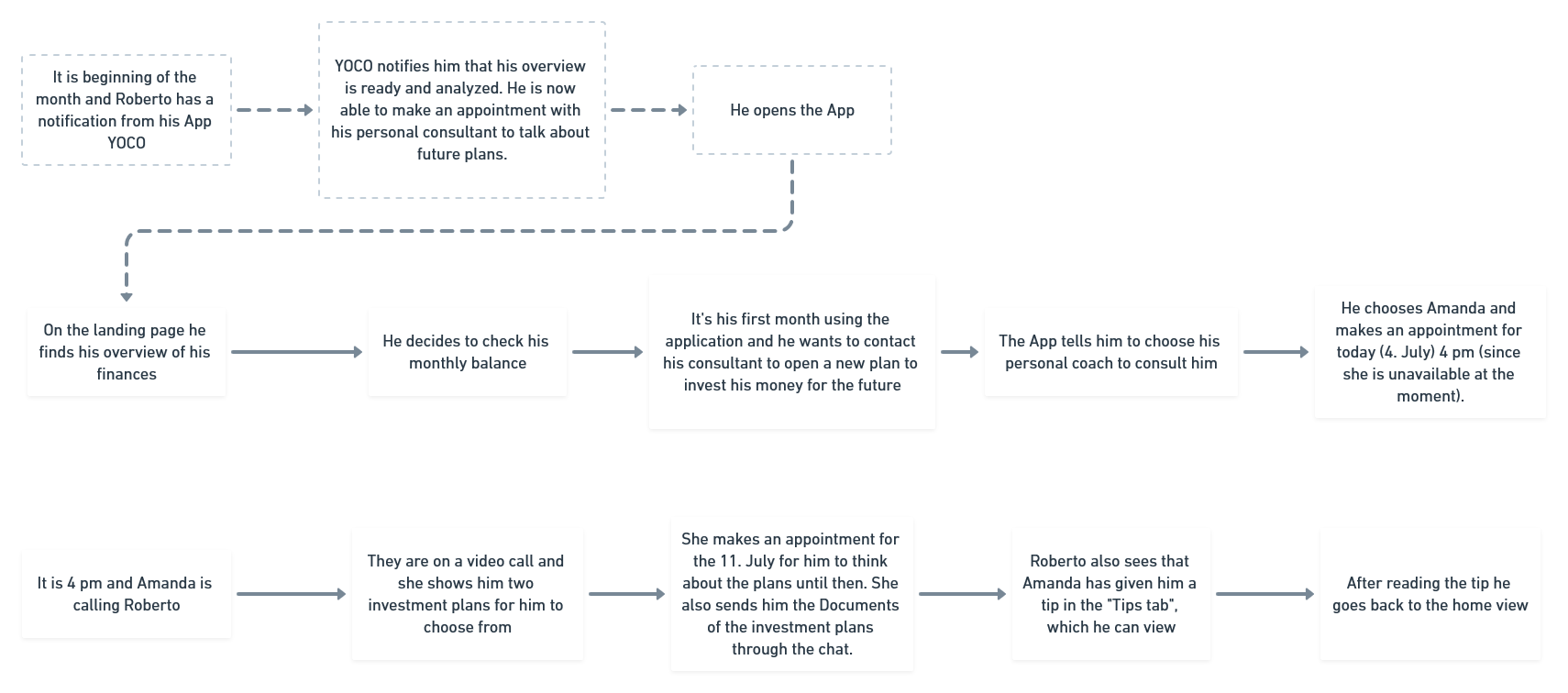
It is the beginning of the month and Roberto has a notification from his App telling him that his overview has been analyzed. He is now able to make an appointment with his personal consultant to talk about future plans.
He opens the App.
On the landing page, he finds the overview of his finances and decides that he would like to have a look at his monthly balance. It’s his first month using the app and he wants to contact his consultant to open a new investment plan for his future.
In the App he then decides to select his personal consultant who will help him. He chooses »Amanda« and makes an appointment for today (4. July) at 4pm (since she is unavailable at the moment). He then goes and takes a break before his appointment with his new consultant.
At 4pm his telephone rings.
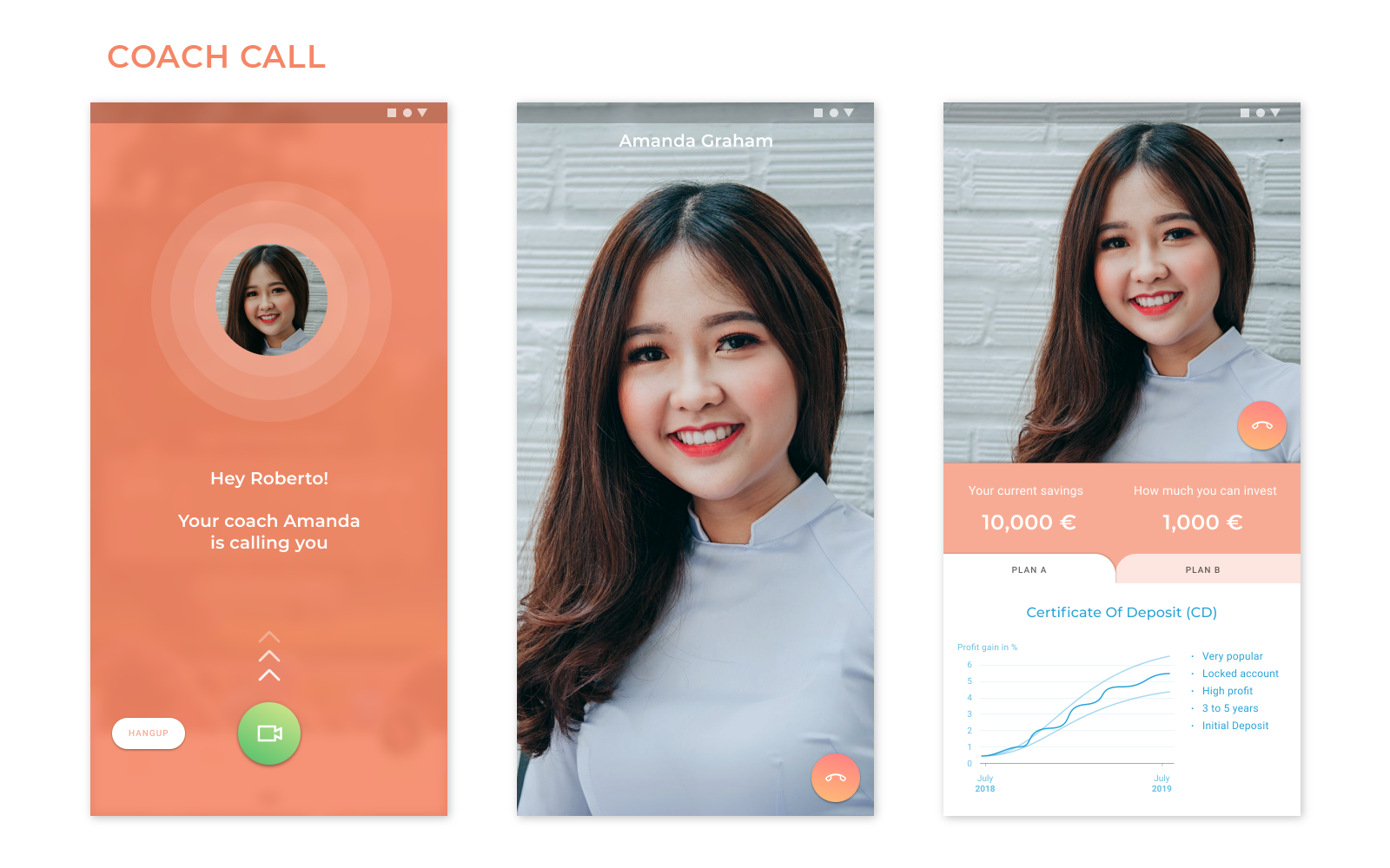
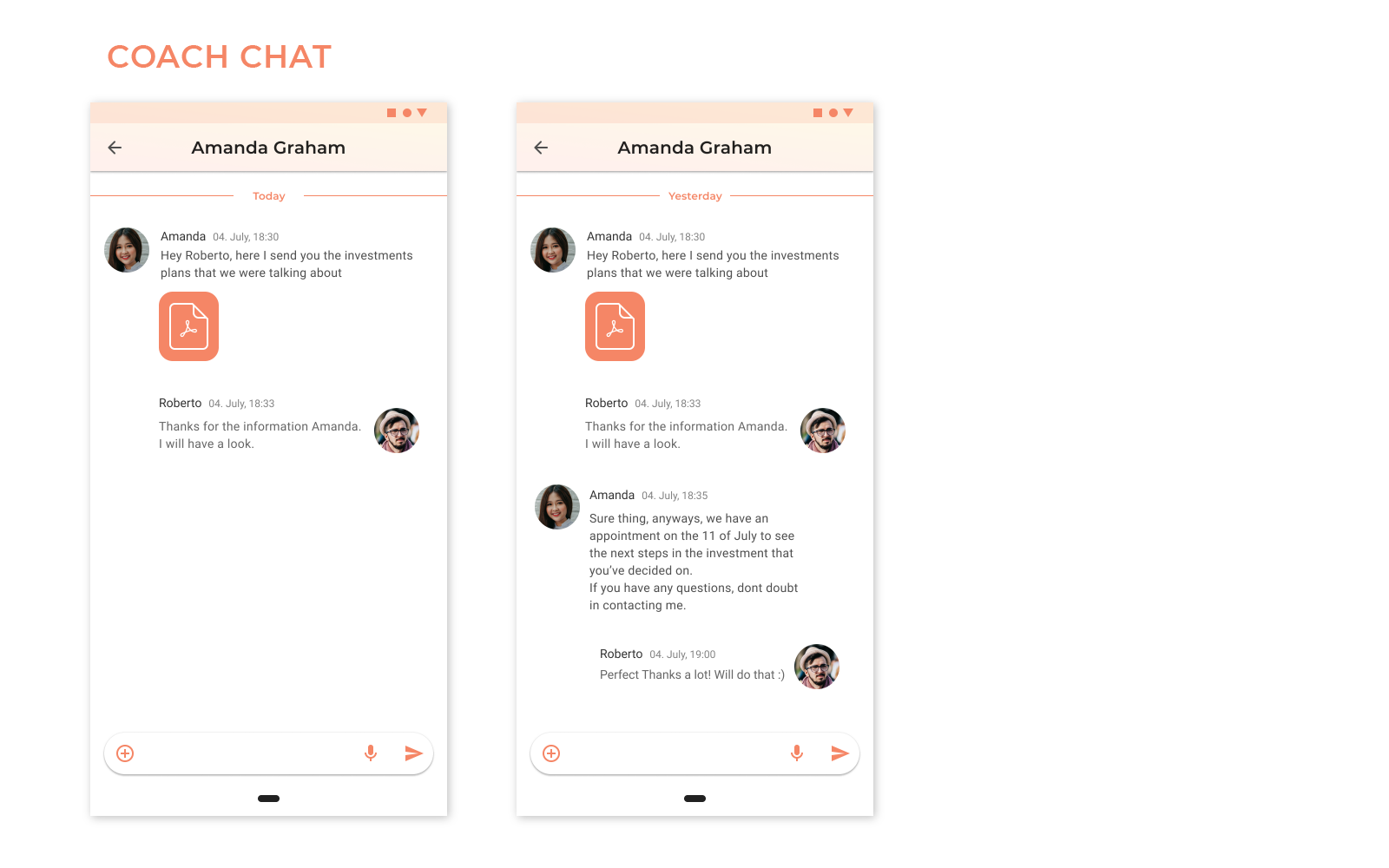
Amanda is calling Roberto. He answers his phone it, connects to a video-call and meets Amanda. They have a nice conversation in which Amanda explains him about his options. She proposes him to think about them and talk again next week. She informs him, that she will send him the documents through the chat so he can read them again in his free time.
They finish the call.
After that, Roberto sees that Amanda has also sent him a tip that could help him with his finances.
He opens and reads it.
Knowing that he has an appointment with her for next week he goes back to the apps main menu. Feeling more calm, thinking that he has achieved the next step in securing his future financially, he finally exits the app and puts his phone away.
Testing & Prototyping
To test the plausibility of our scenario we wanted to test it with real people through surveys and user testing of a lo-fi prototype. Additionally we proposed a hypothesis.
First Hypothesis
Financial Consultants that can be contacted through a video call and are chosen by the user can provide more trust in a financial app.
Idea Definition
As already mentioned, our concept was to emphasize the human aspect of banking for the customer. When opening a new bank account they will be assigned a personal contact, which is tailored to their own wishes and needs. The interface adapts accordingly.
Trust should be built primarily through personal interactions with the consultant; e.g. through simple video calls and/or a chat. The advisor should also be available at all times and for all concerns in order to give the customer the feeling of being in good hands.
Financial Education is activated by personalized push notification (which appear at preset intervals). These then lead to the app, which has information on inputs, expenses and further assisting functions to better manage ones own money.
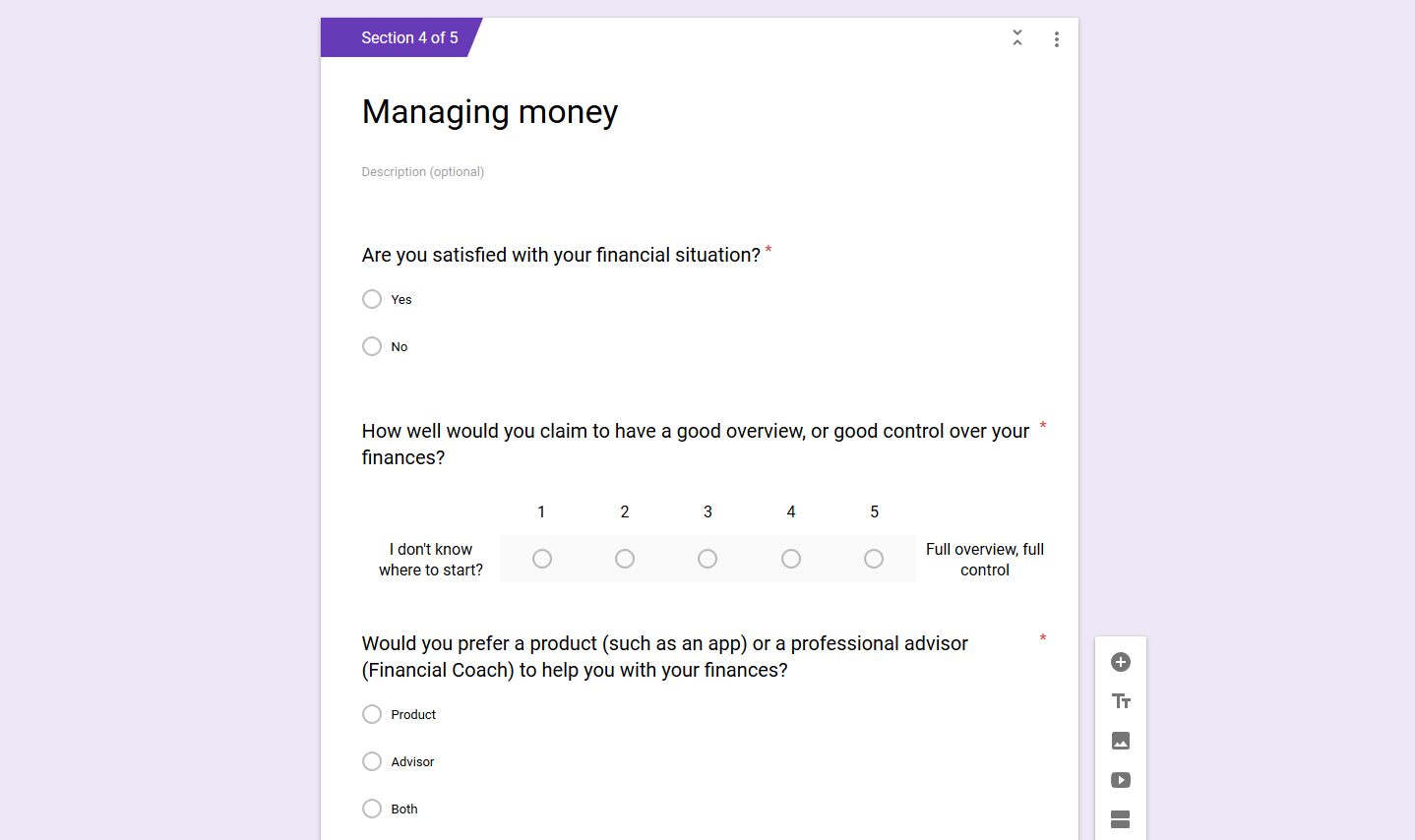
Survey
An anonymous survey was conducted to understand more what people think about their financial situations. We created the survey (in English and in German) asking questions such as whether…
- one is a customer of an online or a traditional bank,
- how they think about their financial situation or
- if they want to choose their own personal financial consultant.
Survey Results
Out of over 65 entries—where most were between 20 and 30 years old—we received the following results:
- 75% are costumers of an online bank
- 73% are costumers of a traditional bank
- 14% visit their bank branches regularly
- 42% go from time to time to their bank branch
- 63% are happy with their financial situation
- 58% think that they have a good overview of their finances
- (but) 58% would like to have help in their finances and 30% are not sure if they need help
- 84% would like to choose their consultant
- 66% say that they have »medium« financial literacy
- 75% want a product with tips
- 81% want to track their own finances
And the most important for our first hypothesis:
- Most (56%) of the people that answer our survey would prefer to meet their consultant in person.
- 4% wanted to have the video call
- 16% did not want to contact a consultant
- 20% preferred having a normal telephone call with they consultant
- 4% preferred to be able to chat with their consultant
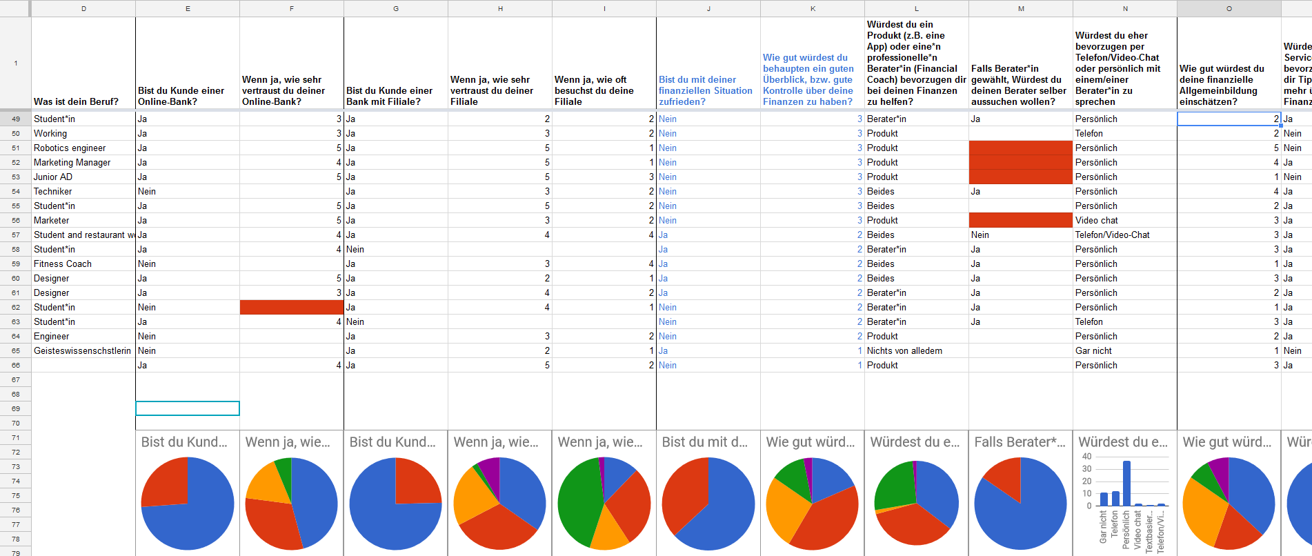
With these results, our first hypothesis was mainly proven wrong.
The Survey suggests that most want to be personally consulted by a person but prefer not to visit their banks. Surprisingly enough the preferred way of communication is via telephone instead of a video call.
We proposed a modified second hypothesis.
Second Hypothesis
Financial Consultants that can be contacted through augmented reality (AR) can provide more trust in a financial App.
Idea Definition
Since we interpreted our results as such that many don’t normally want to go to their bank branches but still prefer to interact with their consultant in person, we thought of creating a product in which the user can do exactly that—but from the comfort of their home.
Therefore, we thought that interactions based on augmented reality with a financial consultant in a financial app would be very fitting in also possibly creating more trust with the users.
We still wanted to test the video call, even though many disliked it since (in online banking) it is mostly associated with the annoying process of identifying you online through a webcam or phone camera. It was still important for us to find out if it could be a viable method of interacting or not.
- Does our target group prefer to interact with their financial consultant over the app through augmented reality calls (AR-calls) or do they prefer doing so through video calls?
- Furthermore, where do they feel more trust?
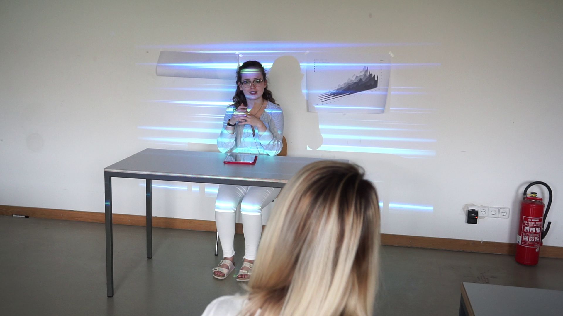
User test
Based on our new hypothesis we wanted to test how users interact with their consultant through an AR-call or/and a video call. For the user test we prepared the following beforehand:
- Create a dialogue in which the coach would advise the user
- Create a low fidelity click-prototype for the user test
- Organize and prepare a room in which we could do our user test
- Organize our equipment
- Get drinks and snacks for the testers
- Create a quick App Prototype
- Prepare a survey that each participant should fill out after the test
During the user test we had two scenarios:
- The person would check the monthly balance, making an appointment with the consultant and making an AR-call and then a video-call.
- The person would check the monthly balance, making an appointment with the consultant and making a video call and then an AR-Call.
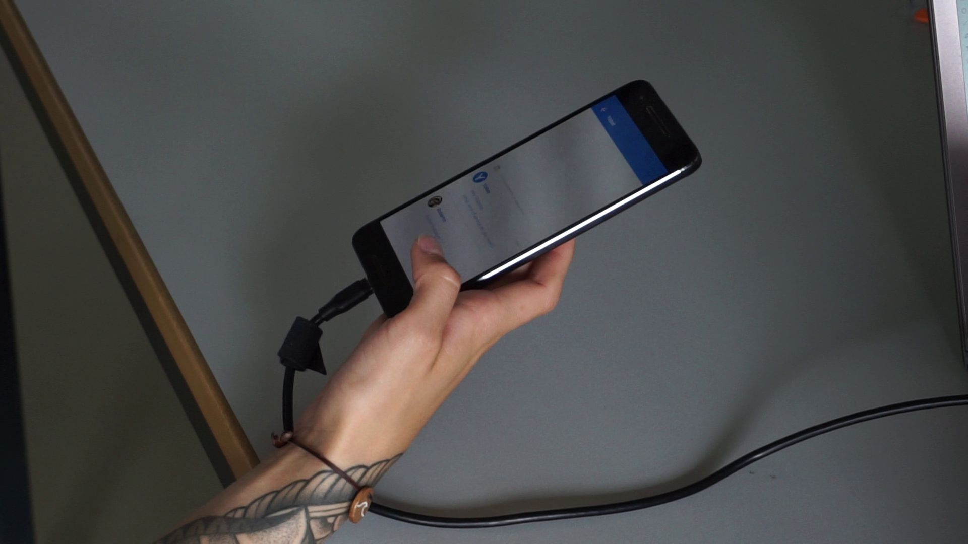
The equipment we used for the test were:
- iPad was used for a survey after the user finished the test
- Nexus 6P was used as the device for the click-prototype
- Nikon D5200 filmed the whole experience
- Video projector connected to a Laptop projected some effects onto the consultant to simulate an AR-Call

User test results
During the test, we had a total of 8 participants with the following results:
- 50% of the testers prefered interacting with the coach through an AR-call
- 38% preferred the video call
- 12% liked both
- 88% would trust the coach whether it was through an AR-call or video call
- 12% found they could trust their coach better through video-call
- 75% found the feature of contacting their personal consultant useful in a banking/financing app.
Our new survey results suggest that our second hypothesis was more or less right:
users do trust their coach more through an AR medium.
We, therefore, decided to create an augmented reality solution of our product and conducted some additional research on this. We tried designing some mockups of how the AR interface could look like and thought up a scenario playing in a not to distant future. This resulted in giving us some problems, though.
Detour: Augmented reality
There wasn’t enough time to do a more thorough investigation about this subject matter that we didn’t feel comfortable continuing with our current results. Our scenario was to vague, the evolution of future technologies was not well thought out and the implementations of the mockup therefor not sufficient for a realistic story.
In the end, we decided to pivot back to a more traditional screen design solution and concentrated on making the interaction with the coach as realistic and enjoyable as possible.
By no means did we scrap the idea of using AR-calls as a possible method of communication, though. AR was going to be an option for the user to communicate with but didn’t play a major role in our idea anymore.
Final Idea
We realized that people prefer to have personal contact with their coach, want to be better at finances but are not really sure in what they would like to invest in.
Another observation we made was that our initial survey told us that video calls with a coach were not very popular as a way of communication; Though, during our user test there were little differences of preference when it came to interacting with the coach »next to you« (through AR) or through a video call. What we could observe from this was that it was important to give the user options how to decide in which form they would like to contact their coach. Knowing this, we could keep working on our initial concept of the human aspect and add an additional aspect of giving the user options of communication to decide on.
Since many are unsure about what they need, we decided to create an App that could help them improve their understanding of their own finances and start having a look into investments. This is especially relevant for many students, who currently don’t have the basis to invest high amounts of money, but will likely earn a lot in the future and can therefore benefit from an existing basis of knowledge in this area.
Trust and the human aspect should not only be translated in an interface which will give you the possibility to make free decisions but also by giving the app an emotional look and feel through the visualization of its content—using warm colors and presenting a relaxed feeling reinforced through proper imagery and iconography.
Meet YOCO
YOCO is a financial app that supports and advises you to easily invest.
We are an independent service with the goal to improve your financial education so that you have full control over your finances.
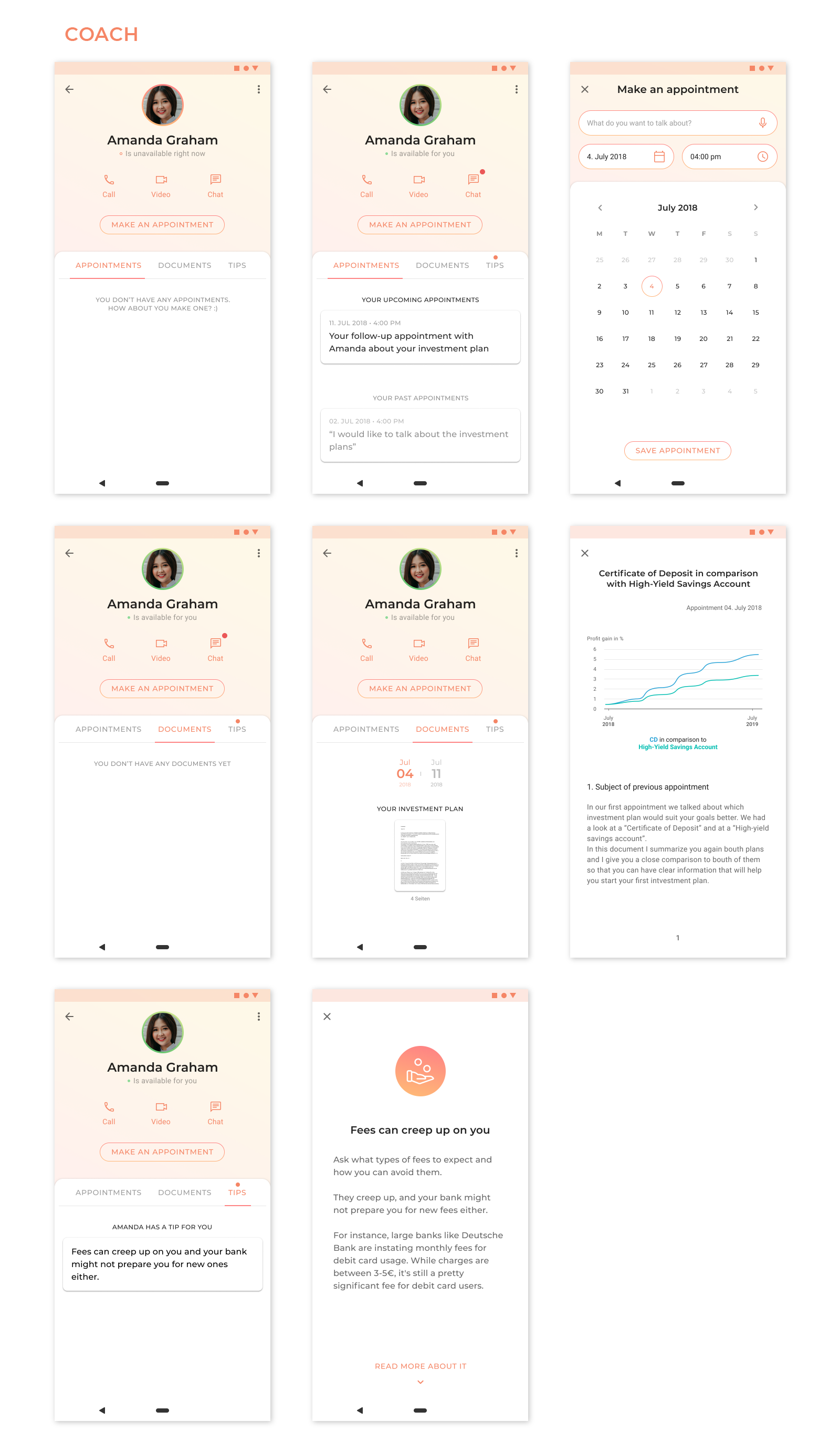
The main function of the app is to provide you with a personal consultant, a coach, whom you choose for yourself.
Basic functions such as displaying your own monthly balance and giving you tips (from your coach) to improve your own finances are included.
You can then contact your coach at any time as needed, through the medium where you feel most comfortable from: video call, voice call or chat.
He or she will guide you through the process of choosing a suitable investment plan to make sure it’s right for you so that you can achieve your goals.
Design process
User flow diagram
To understand best how our persona Roberto would use our app YOCO we’ve created a user flow diagram based on our initial scenario. With this we could understand which functionalities were essential and needed to work perfectly and which were nice to haves.
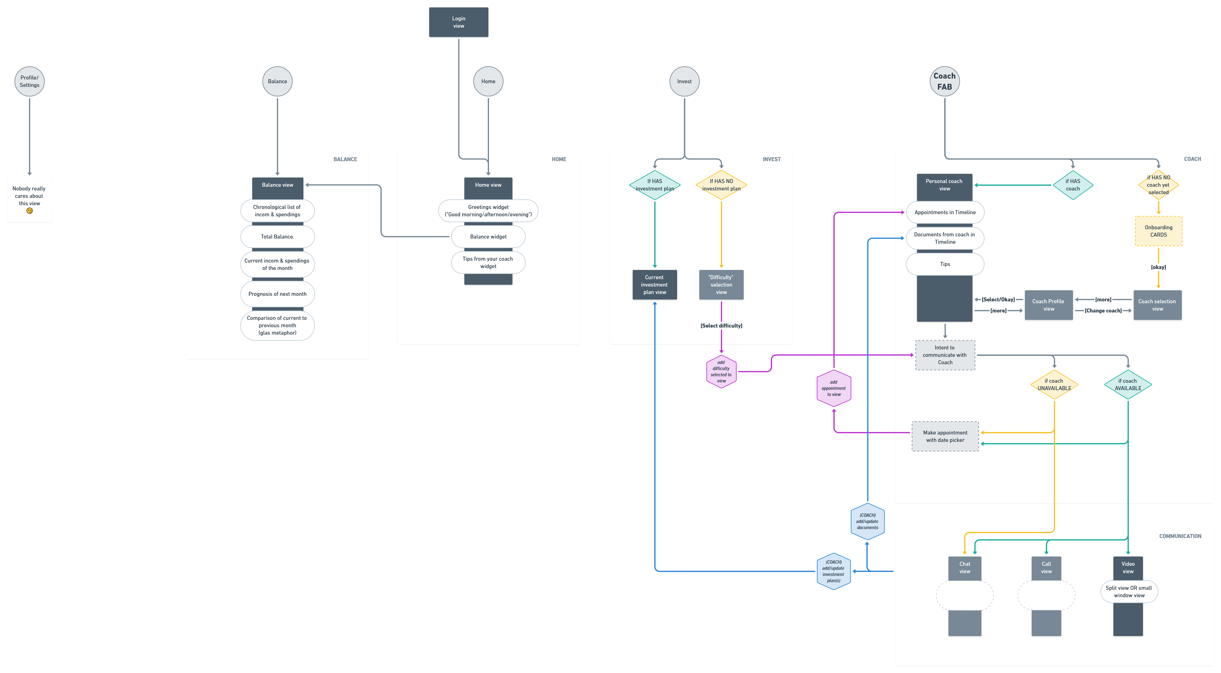
Application Structure
Additionally, we’ve created an application structure to make sure our app makes sense and is plausible. Since it’s overlying main feature was to have the ability to choose and contact ones personal coach from (mostly) every screen in the app our application structure has gotten a bit complex. Especially several conditional states were important to figure out quite early in the design process to not forget which screens had to be created.
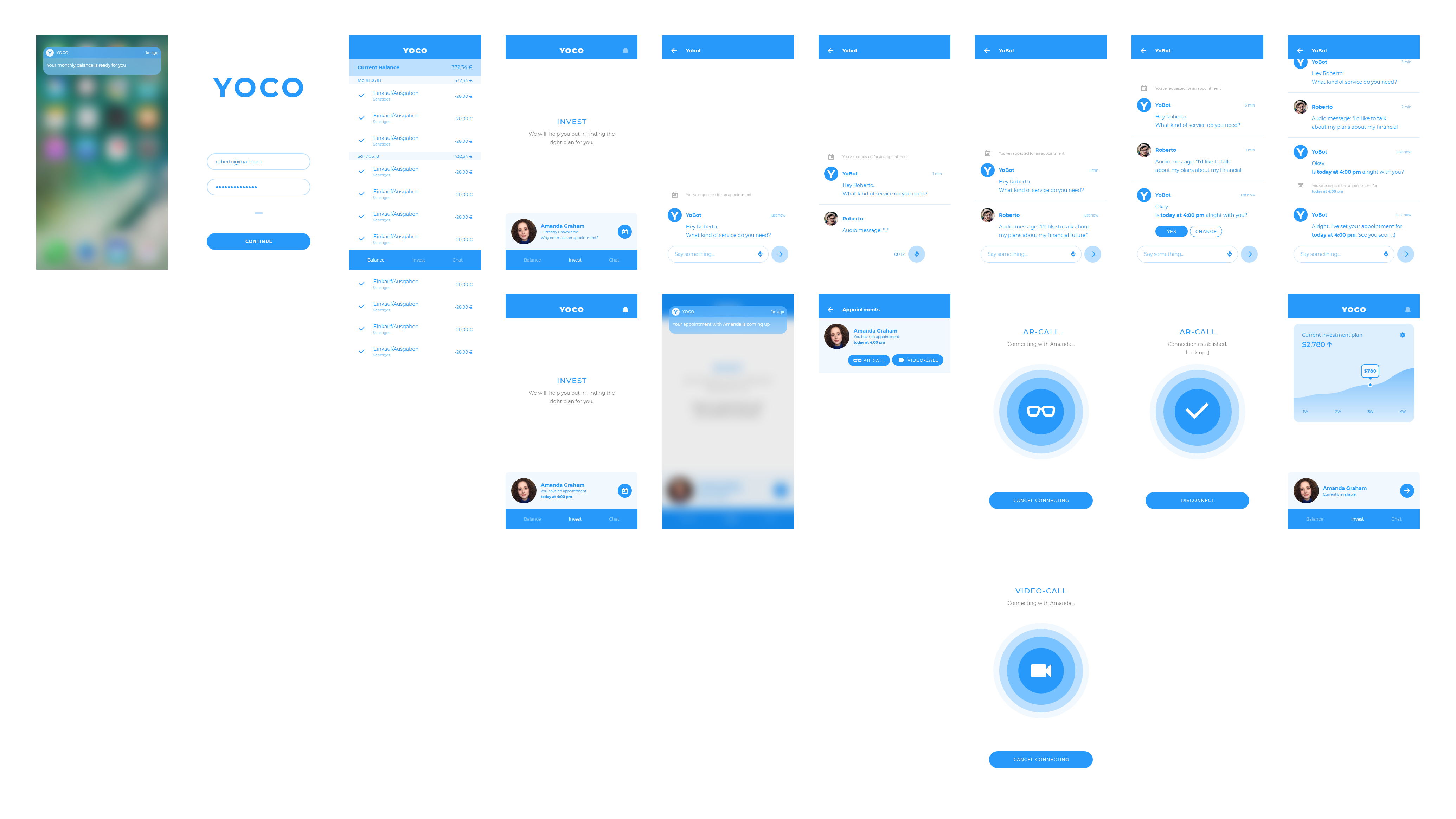
💻 Screens
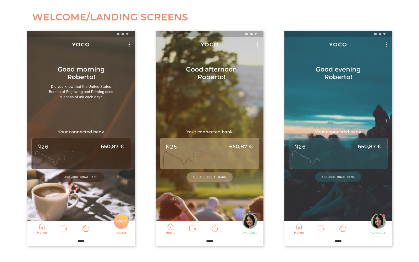
Finally, we’ve created our screens implementing mainly warm colors giving it a more inviting and »cozy« look and feel: The user shouldn’t feel stressed or nervous when using the interface.
We’ve also limited the use of imagery only for the home screen—where the user is greeted with a different background image depended on the time of day—and the profile picture of the coach.
The iconography was chosen to be rounded and lined without having surface colours.
Also, wording was chosen in a way that the user is always referred to personally, e.g. »Good morning Roberto«, »You have an appointment with …«, »Your available money this month …«.
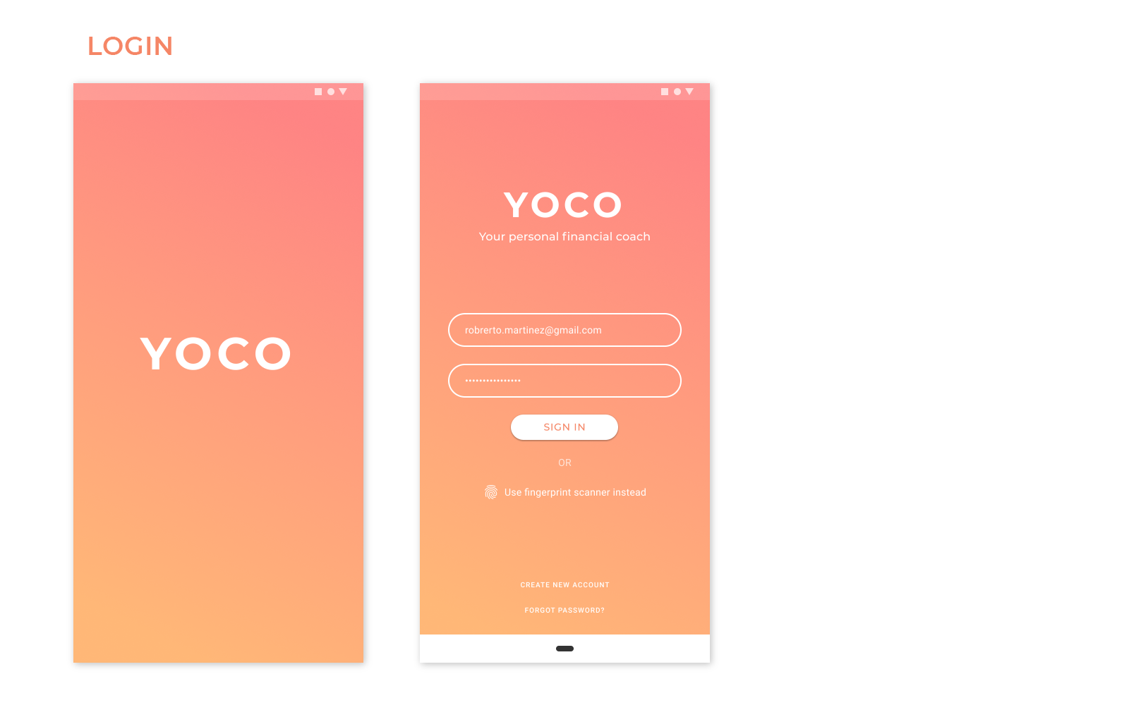
After logging in the user is greeted by a welcoming screen, which has a background image based on the time of the day. It contains a quick access to the balance of the users added bank. At the bottom lies the main navigation bar with links to the home/welcome screen, the balance, investment plans and most importantly to the users personal coach screen.
If a coach hasn’t been chosen yet the app redirects the user to a coach selection screen.
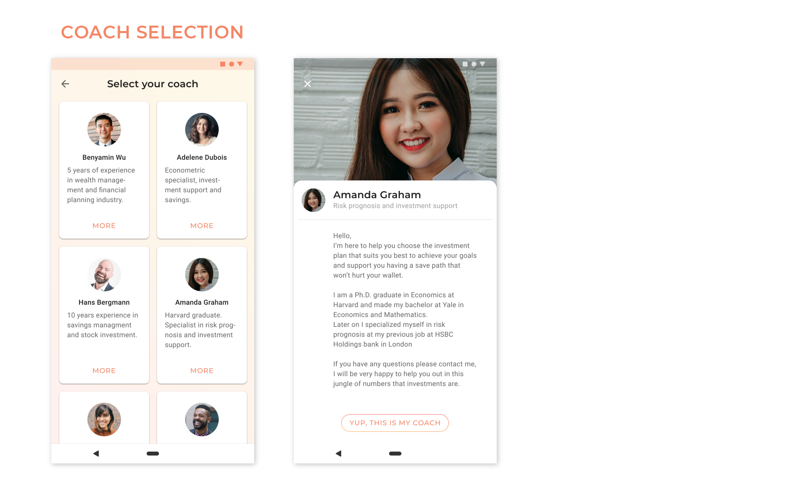
This is the coach screen, which contains many communication and other options relevant to the users needs.
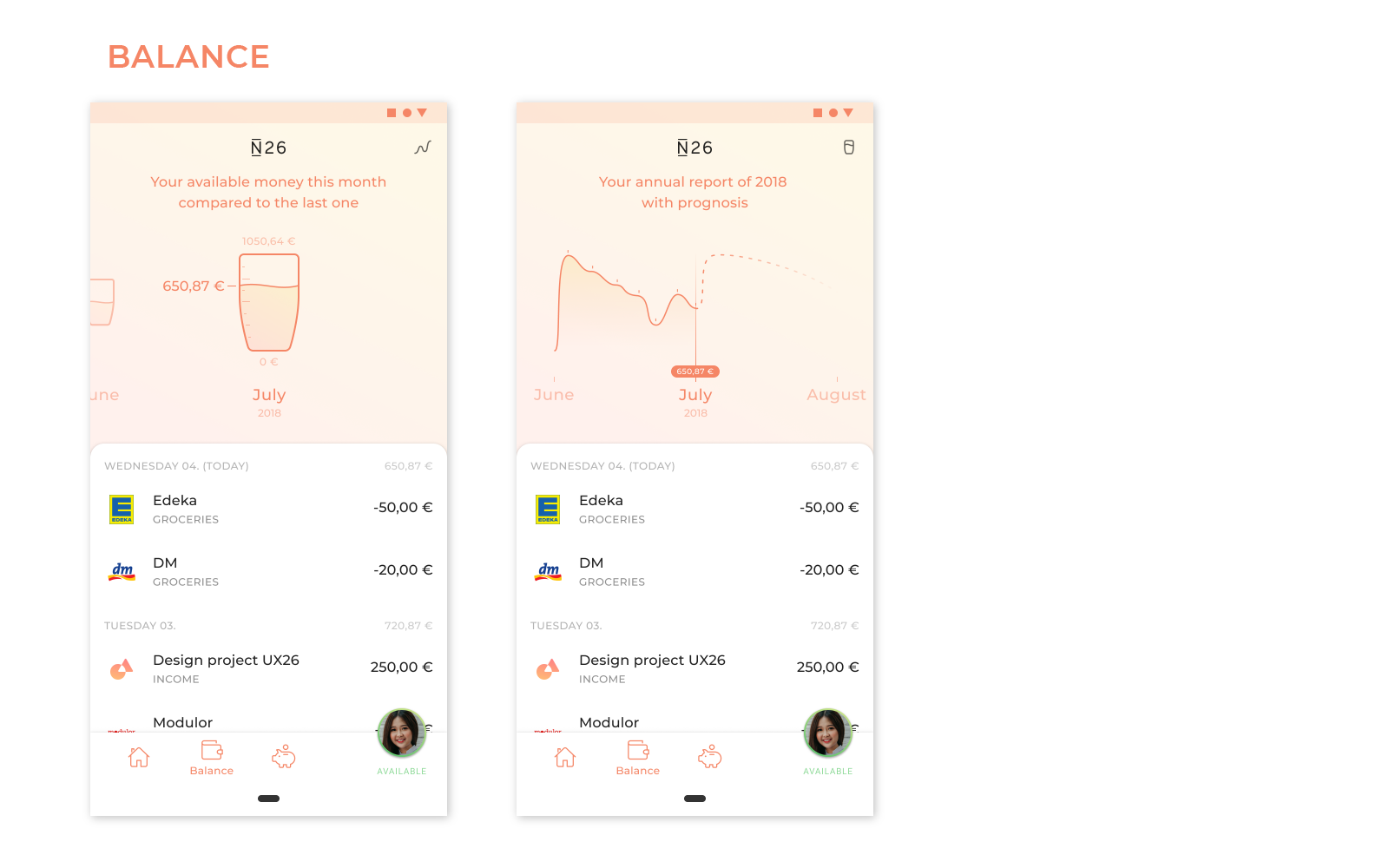
The balance view is comprised of two different visualizations how to show the users income and spendings. The first visualization uses the »glass half full, half empty« metaphor to show the available money in comparison to the last month. The second visualization is a classic curve chart. Additionally there is a chronological list of the balance which changes the visualizations reactively when scrolled.
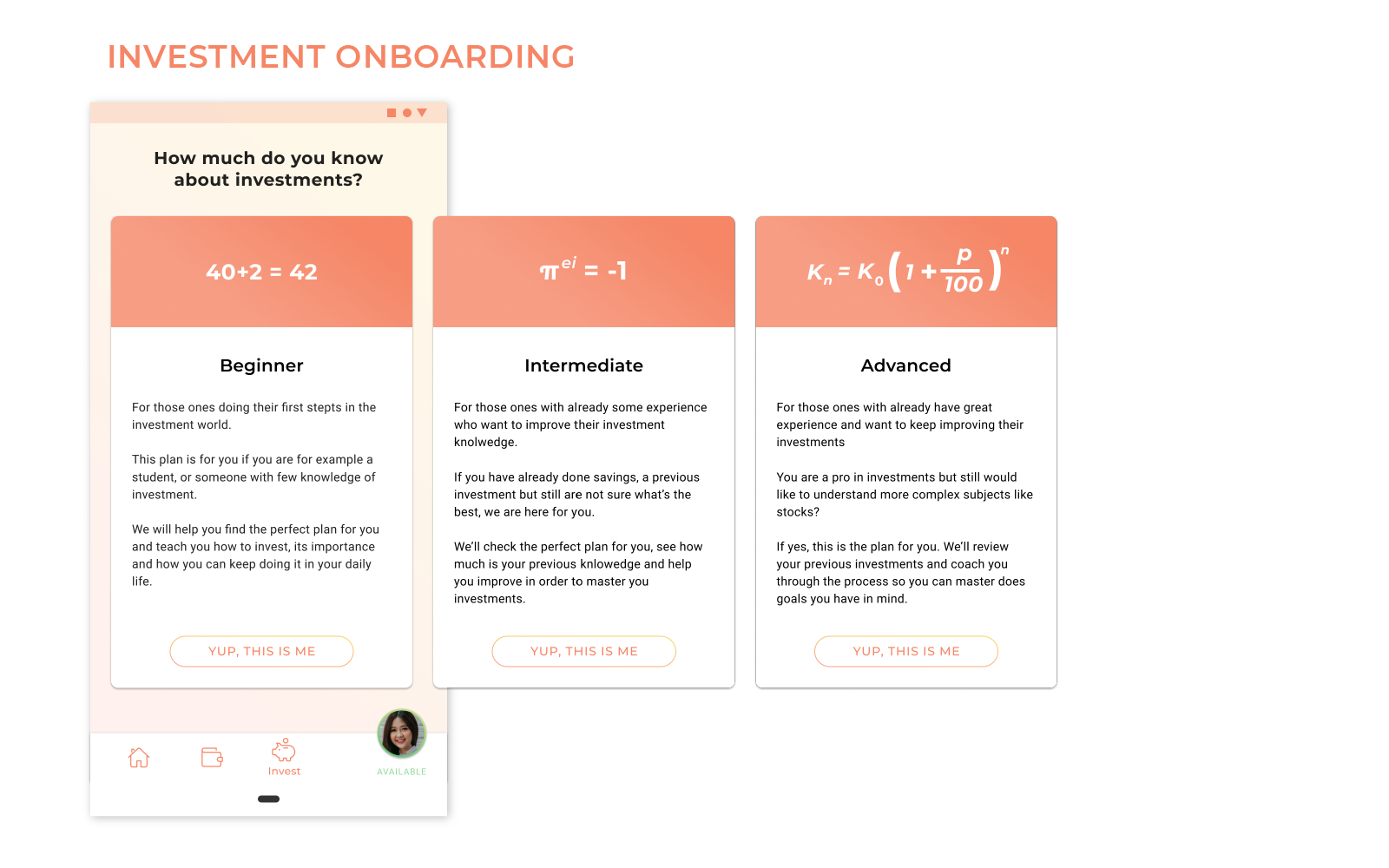
The investment onboarding is there to help the user and the coach decide which investment plan is most suitable at which level of financial literacy. It should also help the user understand where to improve on if desired.
👆 Click-prototype
The click-prototype was created with Figma:
Conclusion & Learnings
Develop hypotheses
Right from the beginning it was quite difficult to find the right way to work with complex topics such as trust and financial education. The long and extensive desk research made it more clear in understanding what the problems were but also made it more difficult to find a fitting and viable solution we wanted to work on. To narrow down the sheer amount of information we’ve collected over the past days, we found it very important to develop hypotheses from our findings to test and iterate upon—via surveys, quick prototypes and mockups, and user tests.
Don’t be afraid to pivot.
At the beginning we were determined to create something totally futuristic and innovative with our AR-concept but realized it being an unrealistic task to undergo in our small time frame. By testing communicating with the coach through AR and video calls we came to the conclusion that the user was more interested in having the ability to choose how to communicate, which subsequently led us to rethink our main idea.
In conclusion…
We felt that we’ve learned a lot from this course. Especially the great feedback from Christian made us realize how important it is to look at every detail—such as assuring consistency in language, colors, imagery, etc.—and never forget about the entire picture (which might change during your research) as a whole.